Emails are the staple of your business and an effective tool to communicate with your customers, but it can also be a source of frustration if they aren't getting the information they are looking for. Without proper format, your emails are bound to end up in the pile of unread emails.
To get the most out of your email marketing strategy, you should make sure that each one looks as good as possible. It means ensuring that your design and non-design elements align well. It also means making sure that all the links work properly so that people can click through to find out more about what you want them to know about.
The world of email marketing is constantly evolving. As the technology behind emails continues to advance, so does the quality of the design. The days of dull, generic emails are behind us—and for good reason! You want your emails to stand out from others, and you want them to be attractive, engaging, and easy to read.
It is not enough to send out a bunch of emails and hope that people respond—you need to know what makes an email stand out, and then use that knowledge to improve your own emails. And it is not just the content, it is about the design. It's not just about the content, it's about the design.

The purpose of your email is to get someone to click or open your email and read it, so you need to make sure that you're sending them a message that will do that. Your email should be attractive in order to make your message stand out from others like it.
Types of email formats
- Plain Text
Plain text email designs without visual elements are pretty old email design types. In this type of email design, there is no color or imagery —instead, there is just text that has been formatted to appear as though it were written on paper or typed into a computer.
This type of email design works well because it is simple to implement if you are a startup or small scale business with restricted resources to hire designers or developers who can create beautiful graphics for your company's emails. However, it doesn't look as professional or polished as other types of emails might during first impressions with customers and potential clients.
2. Rich HTML
HTML emails are often used as a way to show off your company's website. They can be customized with colors and fonts, and they are easy to share on social media. You can even embed videos or images within an HTML email so that it looks like a full-blown webpage.
When you are using HTML email design, you can make changes quickly and easily. This is especially true if you are using a template, which makes it easy to customize the look and feel of your email without having to worry about formatting.
HTML email design also allows you to include multimedia content like images, videos, and even audio within your emails. You can use more than just text in your emails— your creativity and imagination is no longer restricted!
3. Interactive
Interactive email designs use animation, sound and motion to make the user feel like they are interacting with a real person. This makes them much more likely to open and click on the links in your emails.
Essential Design Elements in an Email
- Header
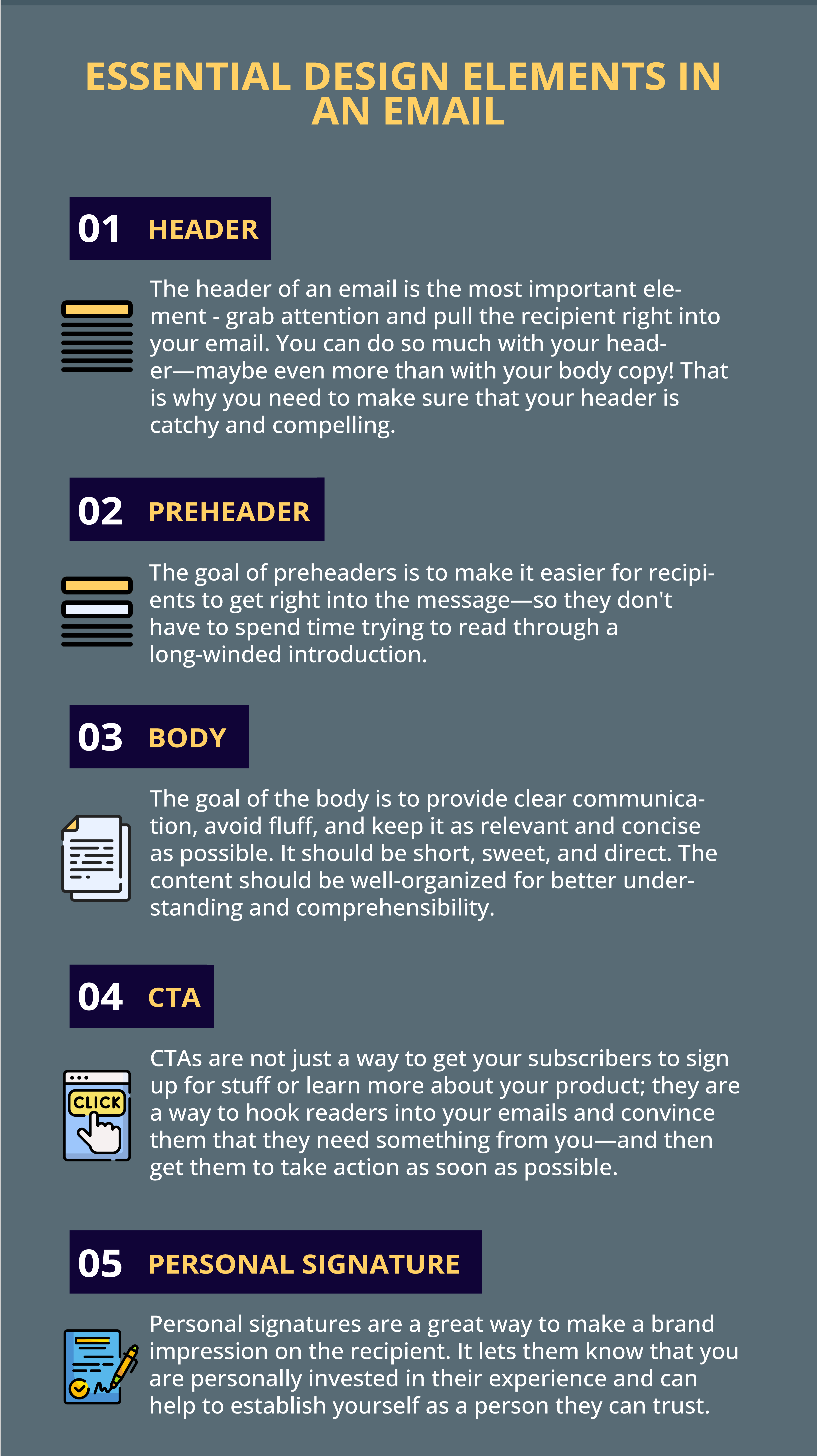
The header of an email is the most important element - grab attention and pull the recipient right into your email. You can do so much with your header—maybe even more than with your body copy! That is why you need to make sure that your header is catchy and compelling.
Best of all, most people don't read beyond the first paragraph when they open an email, so if you have got a catchy subject line and a good header, chances are you will get plenty of clicks. Because the header of an email is the first thing that people see. It is where all of the content is organized and divided up into sections. That is what makes a recipient want to open your message.
2. Pre-header
Pre-headers are not merely a chance to tell your reader what you want them to know, rather they are an opportunity to set the tone of your message. They allow you to give a quick, concise summary of your message so that recipients can quickly understand what they are getting into.
The goal of pre-headers is to make it easier for recipients to get right into the message—so they don't have to spend time trying to read through a long-winded introduction.
In most cases, recipients don't read all emails in their entirety; instead, they skim over them or skip around in order to find what they are looking for. By giving them a very brief summary before diving into the main point of your message, you will increase their ease with reading it.
3. Body
The goal of the body is to provide clear communication, avoid fluff, and keep it as relevant and concise as possible. The body of your emails should be short, sweet, and direct. If you are trying to sell something, then it is probably better to cut out all the fluff and just tell them what they need to know right away. If you are trying to get someone's attention, then you are probably going to have to write in a much more interesting way than that. In either case, the content should be well-organized for better understanding and comprehensibility.
4. CTA
If you are writing an email and your goal is to grab the reader's attention, then CTA is probably the most important thing about it. CTAs are not just a way to get your subscribers to sign up for stuff or learn more about your product; they are a way to hook readers into your emails and convince them that they need something from you—and then get them to take action as soon as possible. The last chance to make someone click—CTA is what makes that happen.
5. Personal Signature
Personal signatures are a great way to make a brand impression on the recipient. It lets them know that you are personally invested in their experience and can help to establish yourself as a person they can trust.
Personal signatures are more than just a signature: they are a way of showing who you are as a person and how you want others to see you. They can make readers feel connected with you and interested in what comes next in your message.

Brand Elements
- Logos
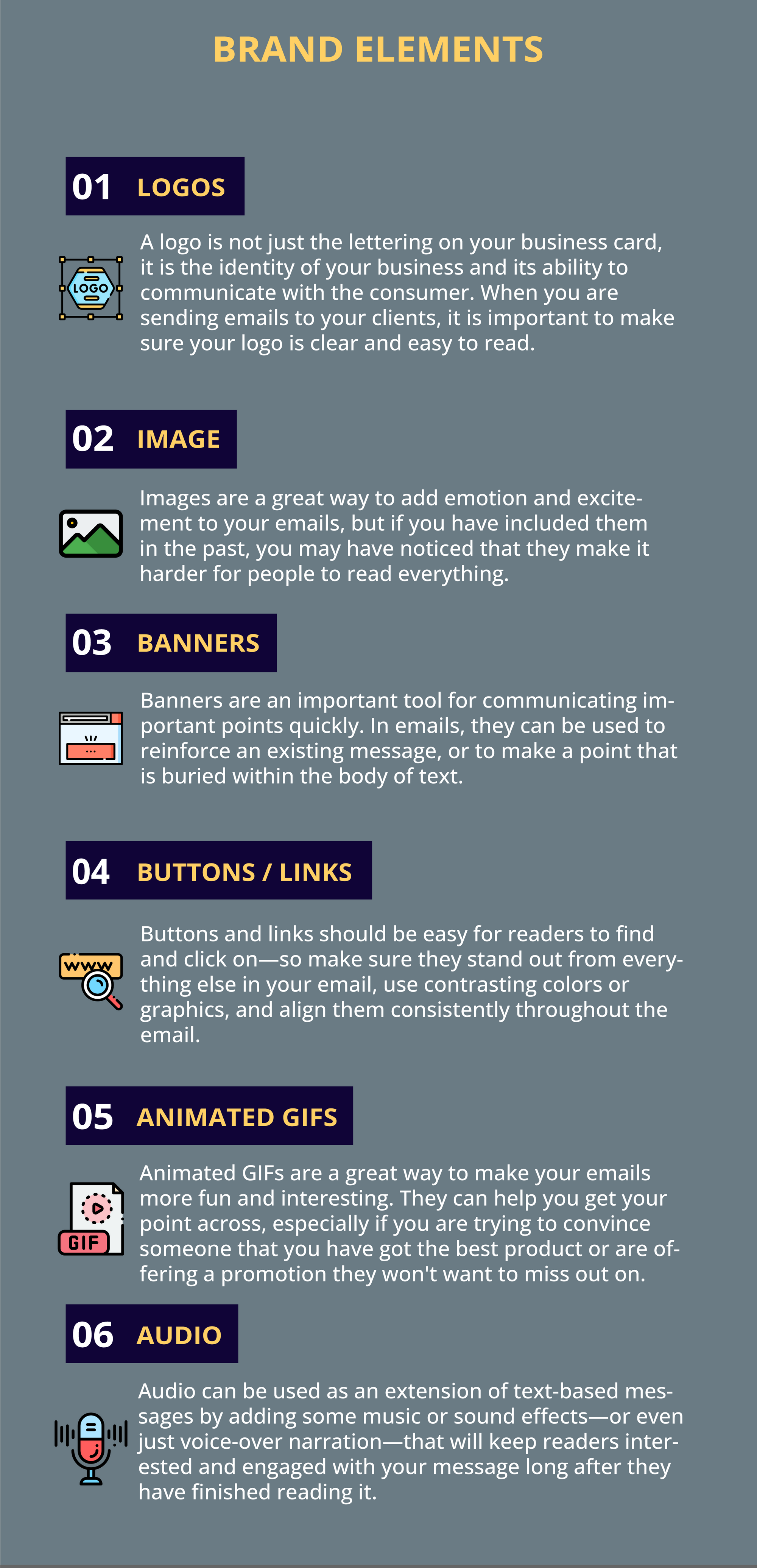
A logo is not just the lettering on your business card, it is the identity of your business and its ability to communicate with the consumer. When you are sending emails to your clients, it is important to make sure your logo is clear and easy to read.
This is a crucial element in building brand awareness and establishing brand recognition, as well as increasing engagement with your audience. The size of your image should also be appropriate for each message—a small image may not be something that people will want to keep looking at if they don't find it appealing or interesting enough.
Finally, make sure the dimensions of your logo are correct so that it doesn't look pixelated when it is enlarged within an email's layout (which is often done).
2. Image
Images are a great way to add emotion and excitement to your emails, but if you have included them in the past, you may have noticed that they make it harder for people to read everything.
We have all been there—you send out an email with a juicy article and an image on it, but you are concerned that people won't be able to see the text at the same time as the image. This is especially true if you are using images of text or tables, which can be difficult for some people. So how can you make sure your images are relevant and clear?
The first thing is to take care of the alignment and dimensions. Make sure that your images are centered vertically, horizontally, and even diagonally. You should also make sure they are not too big. If you are worried about taking up too much space on someone's device screen, consider using an image gallery instead of just one image—the gallery will show multiple pictures at once instead of one large one.
3. Banners
Banners are an important tool for communicating important points quickly. In emails, they can be used to reinforce an existing message, or to make a point that is buried within the body of text. In order for a banner to be effective, it needs to be sized appropriately, and it should align with the body text below it so that there is no need for additional spacing between them.
It is also important to consider how big your audience will be seeing this banner—if you are sending an email to just a few people, you don't need a big banner; if you are sending an email to thousands, then obviously you do.
4. Buttons/ Links
Our attention spans are all too short. We are constantly bombarded with emails, text messages, and social media updates that demand our responses—and we don't have time to read long-form content. So how do you keep your reader engaged?
One way is with buttons or links in your email campaigns. These buttons can be used to redirect the reader to other parts of your campaign, which keeps them engaged and intrigued about what is next for them. Buttons and links can also help you personalize emails for each recipient so that you are not sending the same message to everyone who opens it.
Buttons and links should be easy for readers to find and click on—so make sure they stand out from everything else in your email, use contrasting colors or graphics, and align them consistently throughout the email.
5. Animated GIFs
Animated gifs are a great way to make your emails more fun and interesting. They can help you get your point across, especially if you are trying to convince someone that you have got the best product or are offering a promotion they won't want to miss out on.
6. Audio
Audio can be used as an extension of text-based messages by adding some music or sound effects—or even just voice-over narration—that will keep readers interested and engaged with your message long after they have finished reading it. It also adds a level of interactivity and engagement that makes users feel more connected with the brand behind it. If you are looking for new ways to increase engagement rates among your subscribers, try adding some audio into your next email campaign!
7. Links / attachments
Email marketing is a great way to reach your audience. However, it is important to ensure that you are meeting their needs and interests in the best way possible.
One of the most important things you can do to ensure that your email campaigns are a success is to track analytics and ensure security. Without tracking analytics, it is difficult to know which emails are being opened. This can make it difficult for you to determine which types of content are performing well or poorly, which could help you determine what kind of content or subject lines should be used in future campaigns.
It helps you understand what works best for your audience. Tracking analytics also allows you to see how long each email takes on average before opening—this will give you an idea of when certain times of day tend to get higher open rates than others (for example).

Conclusion
An email is a place for all of your design and non-design elements to come together, and when you have a good balance of them, it can really shine. Email design is a craft. It is not just about aesthetics; it is about how you use the elements of a message to accomplish your purpose. All design and non-design elements in an email should be used in proportion for an email to perform well.

When you send out a mass email, you want your recipients to feel like they are receiving the best possible content—and not just a bunch of stuff they don't need. You also want them to feel as if they have time to read everything, and that they will be able to focus on one thing at a time when reading through your email. If all these elements are not properly aligned, it will make your message seem disorganized, unimportant, and uninteresting.


